2008年12月17日星期三

Illustrator Jimmy

Jimmy is a Chinese artist, who was born in Taipei. He had worked in advertising companies for 12 years. Now he works as an illustrator. Since 1998, Jimmy published several illustrated books with amazing originality and multi-faceted narratives. He set a fashion in creating and publishing illustrated books in local and international markets. Utilizing images as a refreshing form of literary language, Jimmy creates in his works poetic frames that emit charms and appeals. He has published more than twenty books so far, and they are translated into English, French, German, Greek, Japanese, Korean and so forth. Being the most popular illustrator author in Asia, creating lots of fantasy and touch hearts cross all generation, however, with low profile personality, he enjoys the family time more, lives a tranquil life and devotes most of his time to work.


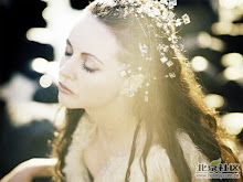
This is one classical scene of Jimmy's most successful story: Turn left, turn right.
It looks that his works are watercolor paintings and made by hands. The outline of objects are rough. The lines of objects which should be put in straight ways were wry. Comparing with Natalie's illustrations, he doesn't care so much about the details. The color he uses are brighter and more gentle, while Natalie likes to use red, black and other flamboyant ones.


The features of Jimmy's illustrations:

Jimmy likes using symmetry: horizontal, vertical and diagonal ones.


For the background, Jimmy always put dense little stuffs to decorate it: flowers, apples, fish, grass and so on.


In Jimmy's works, trees won't get standing well.


Jimmy likes animals so much and he appeals everyone can treat animals well. When he's drawing, he often put those animals as big as he can, in order to show the appearance of the animal. Because the animals in his illustrations are endued with human's feeling and expression ways.


Well, the main reason people like Jimmy's books so much, is that he's reflecting the facts of the society and talking about the real sides of human.

"The star which can't be touched is most shining.

The little fish which escapes is most beautiful.

The movie which I missed is most wonderful.

The lover which I lost is the one knows about so much.

I don't understand all the time:why do these happen?"

Illustrator Natalie Shau


Natalie Shau is a 23 years old Vilnius (Lithuania) based artist. She works mainly in digital media and her pieces mix photo manipulation, 3D elements and digital painting.


About her work, she says she "enjoys creating surreal and strange creatures, fragile and powerful at the same time. Her style was influenced a lot by religious imagery, fairytales illustrations and many classical and modern painters."


Once I saw the picture below, firstly I was attracted by the face of the woman: delicate face, the black hair is waving under the elegant hat and the wonderful stature. Well, the eyes demonize her. Legs are turned into many ink marks which track the way she passed. Or, when she was walking from the end of the path to here, her legs are getting comminution in the way. This is quiet impenetrable, but creative.


The background here, I was thinking that the whole background is in one layout. Then I found the right part was put darker than left one. The branches are quiet clear in bright green. So I think the artist tries to set them in different layouts. The woods with the little path which disappears as a point is classical as well as typical design. The whole illustration is detail-concerned, carefully processed. The basic keynote of the picture is absurd, cool, coquettish and exquisite.

I don't get deep meaning here, and I think it will be a good decoration of some specific music or stories.


I found that she really likes the spuare shape. Many other works were done like this. And in this one, a round scene was used inside it which giving a sense of that we are seeing with a telescope. That's quiet creative.


If you like Natalie's style, here are two links I recommand:


http://www.myspace.com/natalieshau
http://natalieshau.carbonmade.com/
I pretty like the second one. For the works are ordered in specific series. They are not that new, but well-organized which can help you a lot once you want to analysis her illustrations.

2008年12月5日星期五

2008年11月23日星期日

Visual Communication Assignment2


"Credit Crunch":


When financial crisis comes, people might not get sense at once, but banks will take actions immediately, such as credit crunch. They won't loan money to companies or people easily as usual. What they do is that they don't give money as required, even no money for companies or people's business.

Well, without enough money, the business can't run well. Just like the boat in the
picture. Boats only can sail in the water. Bigger size boat need deeper water area,
while bigger business need more money to run.


No money, business get stuck. No water, the boat falls on the ground.


Lust:


I took this picture on last valentines day. It's a club who wanted to attract more
people to join to make friends. They used a well-dressed, sexy and charming young lady as the cover girl.


I didn't take this picture at full-face position. That's kind of boring. I took it
from the girl's side to emphasis her. And by this way, I put her in the center of the
whole picture as well.


Actually, I have another idea about this word. Only one red high-heel shoe will be
presented in the center of the picture. The "red" should be coquettish one. The back ground could be black. Maybe a goblet is thwart near it with little wine in it. Red high-heel shoe can give a sense of sexy-dressed, while the goblet means alcohol. These two things can make people associate with the word "lust".


Power:


I took this picture from plane when came to Dublin. I can see "power" from it.
Thousands years ago, this land there might be plain or hills with rocks and plants in every corner. However, now, it is thickly dotted with these artifical architectures: buildings, bridges in different sized for different functions, which show human being's abilities and power. They can easily change everything. They are in charge of the world!


Lost:


I took this picture in Royle hospital garden. I don't what this stuff used for. Maybe it is just a decoration. I look at it as an art work: classical style, detail- concerned, exquisite...It might be created 100 years ago, and a little destroyed by time.

As part of the background, two machines are working on some building architectures which make me think about the modern building style: simple and unitive. In today's society, people are so busy that everything they need should be convient and easy to use. They abandon the idea of in pursuit of individuation and refinement.

Unforunately, art elements are lost in their life.


Family:


As a family, members are not only have similar appearance, but also be anaclitic. They are pleased to help each other, enjoy the happy time, go share and to be companies in tough time.

The guy in the picture was my friend. His daughter broke her leg, but still wanted to see the mountain and enjoy the nature. The father hold his daughter on his back and walk around wherever his daughter wanted to go.

I set characters in a small size and huge sky. Because I want to deliver a message: the world is big while the person is little. The reason people can get born and live well is the word "family".
That's my work. Looking forward to your comments!

2008年11月17日星期一

How to add background music to your HTML page


How to make your web site become more magnetic? What people normally will do is adding background music to the pages of web sites or blogs. Here is an introduction of how to add background music to your pages.


Erenow, I need to describe some shortcomings of using background music:

1. More bandwidth is needed. Of course, we can use the mp3 format instead of wav one which has smaller music file size, but more bandwidth is still needed than those general HTML pages.
2. W3C doesn't support "embed" tags.
3. Users can control the volume by hand, but adding background music will affect the browsing definitely.


By knowing about these, if you still want to do so. You need:

First of all, you should have a music file in mp3, wav or mid format. It also could be music file URL on the web. Whatever you choose, smaller size is always the best. Some people will recommend the URL one.

Then, we can embed it into pages with HTML code. Here, we use "embed" tags.


The code means: once a user open this page, the given background music would be loaded and played. When the music is finished, music is stopped. If you want to repeatly play this music, "loop" attribution could be input. If the value is set as true, the music will be repeated; if false, it will stop once finished. The code is like this:


Meanwhile, you can adjust the height and width of broadcaster:


Sometimes, this music player might breaks the layout of your web site. We can use "hidden" attribution to hide the music control panel to make it just play in background:


2008年11月7日星期五

50 Surefire Web Design Tips (Part 2)

Tips On Writing For The Web

26. Write in layman's terms so that everybody can understand your content, unless you're running a technical site for technical people.
27. Reading from a screen is painful: use 50% less words than you would use on print.
28. If a page is too long, break it into several pages and link to them.
29. Don't use font sizes smaller than 10pt. for the body of your page. Specify your fonts in percentage terms instead of pixels to let users set their own size preferences using their browser's text view options.
30. Use a spell checker. Spelling mistakes are embarrassing and hurt credibility.


Tips to Know Your Customers

31. Ask for feedback: include a feedback form in your Contact Us page.
32. Publish an ezine and include a subscription form in your homepage. Give your customers valuable information and encourage them to contact you.
33. Include polls and other tools to gather market intelligence.


Tips on Linking

34. Make your links descriptive. They should indicate what the user will be linking to, as opposed to just saying "click here".
35. Don't underline anything that is not a link.
36. Underline your links and use a consistent color for them across your site (preferably blue).
37. Use a different color for visited links, so that your visitors know where they've been (preferably purple or a more subdued tone of the unvisited links color).
38. When linking to a non-HTML file, such as Excel, Word or Acrobat, make it evident, by including a small icon next to the link.
39. Don't link to "under construction" pages.
40. Make sure that your links work and that you don't have broken links. There are free online tools that can help you with this.
41. If you use graphic links, don't forget to use the ALT attribute. The ALT attribute should describe what you are linking to.


Tips On How To Use Graphics

42. Optimize your graphics. Use only .gif and .jpg formats. Make your image files as small as possible while maintaining acceptable quality. Use a free online graphics optimization tool.
43. Use thumbnails (miniature versions of a picture) and make them clickable to the actual size picture.
44. Avoid graphics that look like ads. People ignore them.
45. Use the ALT attribute on pictures, even if the image is not a link. It helps users with disabilities and people who have turned off graphics.


Tips To Optimize Your Site For The Search Engines:

46. Create short, descriptive page titles, to entice search engine users to click on your links.
47. Create a site map containing all your pages, and link to it directly from your homepage. Search engine robots will follow the link to your site map and will most likely add all your pages to their index.
48. Decide what the two or three main keywords are for each page (the words you believe search engine users will type to find your page) and repeat them often in your page title, description meta tag and page body.
49. Create a Links page and call it Resources. In it, place links to those sites that have agreed to place a reciprocal link to your page. The more inbound links you have from quality sites with a topic related to your site, the better your site will rank with the search engines.
50. Use more text than graphics, and minimize the use of Flash and JavaScript. Search engines heavily favor text and will crawl and index your site faster.


by Mario Sanchez

2008年11月2日星期日

50 Surefire Web Design Tips (Part 1)

I found these stuffs from other website. I hope it can help everyone a lot.


TIPS TO BRAND YOUR WEBSITE

1. Include your logo in all pages. Position it at the top left of each page.

2. Complement your logo with a tagline or catchy sentence that summarizes your business purpose. For example "Always low prices" is the tagline for Wal-Mart.

3. Create a favicon. A favicon is that small graphic that appears next to the URL in the address bar of Internet Explorer.

4. Have a consistent look and feel in all your pages. Use a color scheme and layout that are clearly recognized across your site.

5. Have an About Us section, that includes all relevant information about you and your business.

6. Include a copyright statement at the bottom of each page.


TIPS ON WEBSITE NAVIGATION

7. Design your pages to load in less than 10 seconds (50Kb maximum size, including pictures).

8. Group your navigational options in relevant categories.

9. Use common names for your menu options: Home, About Us, Contact Us, Help, Products. Avoid "clever" or "trendy" alternatives.

10. If your site uses Flash, also provide an HTML version for users who prefer a less fancy, faster site.

11. Provide simple text navigation links at the bottom of long pages, so users don't need to scroll back up.

12. Link your logo to your homepage, except in the homepage itself. Put a link to your homepage on all your internal pages.

13. Display a "breadcrumb trail"; it is basically the path from the homepage to the page where you are. A breadcrumb trail looks like this: Home > Section > Sub-Section > Page, and it greatly facilitates navigation.

14. If your site is too big, provide Search capabilities. Include a search box in the upper right corner of your homepage, and a link to a Search page from your interior pages. Freefind offers a free and powerful search engine for your site.

15. Set your search box to search your site, not to search the web.

16. Create a custom error page that displays a simple site map with links to the main sections of your site. That way, you will not lose visitors that have followed a bad link to your site or who have misspelled your URL.


Tips On Layout And Content Presentation

17. Save the top of your page for your most important content. Remember: good content must flow to the top.

18. Lay out your page with tables, and set the width in percentage terms instead of a fixed number of pixels. That way, your page will always fit the screen, without the need to scroll horizontally.

19. Optimize your page to be viewed best at 800x600 (the most popular resolution at the time of this writing).

20. Use high contrast for the body of your page: black text on white background, or white text on black background work best.

21. Don't use too many different fonts in one page. Also, avoid using small serif fonts (like Times Roman): they are difficult to read from a computer screen. Verdana is the most web-friendly font, since it is wide, clean and easy to read.

22. Avoid long blocks of text. Use tools that facilitate scanability, like bullets, subtitles, highlighted keywords, hyperlinks, etc.

23. Avoid amateurish features like: numeric page counters, wholesale use of exclamation points, all caps, center justified blocks of text, excessive animated gifs, busy backgrounds, etc.

24. Don't use pop-up windows. They distract your visitors and are immediately dismissed as ads.

25. Test your site so that it looks good in different browsers and resolutions.


By Mario Sanch


And here, a Chinese edition is available. Chinese friends can have a look at this link: http://www.jingzhengli.com/resource/20031118174928emarketer_mario_design.pdf

2008年10月31日星期五

Kagaya(2)

An Introduction to Kagaya

Kagaya was born in 1968. He is Japanese illustrator and good at digital painting.
In his childhood, he has already been interested in natural science and cosmography. With the widespread of computers in 1984 in Japan, he started paid attention on the computer technology. In 1988, he joined Tokyo Designer School of Graphic Design to learn design and began his professional painting career. Once graduated from the college in 1991, he worked for Hoshino-techo co.,ltd., from when, he started to use computer painting frame to synthesize his work. That was the prime period for him to adopt the computer application into graphics and images area. The final project of the college which was done by Kagaya was “Fantastic Starry Night” which was published as constellation postal cards. They once were the best sell goods in shops. To 1995, all his works were done by computer, which created the epoch-making “digital painting” art in the painting field.
His most popular magnum opus are “Celestial Exploring” 、“The Zodiac” and etc.


Below, I collected his "The Zodiac". Come to have a look at your constellation!!


Aries 21/03-20/04


Taurus 21/04-21/05


Gemini 22/05-21/06


Cancer 22/06-22/07


Leo 23/07-23/08


Virgo 24/08-23/09


Libra 24/09-23/10


Scorpio 24/10-22/11


Sagittarius 23/11-21/12


Capricorn 22/12-20/01


Aquarius 21/01-18/02


Pisces 19/02-20/03


2008年10月2日星期四

Kagaya(1)

Hi, guys!

This is my first time to create a blog. I am exploring everything about this.....First time, I wanna put some pictures of Kagaya, which I mentioned in Visual Communication class.

My favorite picture for VC.


This is my wallpaper for the moment.


Do you like it?